User survey
For the sake of prioritizing resources, product users were asked to rank features they would like to see redesigned/improved.
They were to rank their most preferred choice and their least preferred choice on a scale of 1-6
Verra Mobility Corp: Verra Mobility provides technology solutions to make mobility safer and easier
Modernizing the design, improving usability, functionality and performance of the enterprise legacy SaaS web app, AXSIS.
Jennifer Skouson - Product Manager
Heath McDonald - User Interface Design
I was not part of the core team that worked on this project. My involvement was with the focus group. My approach to this project is from the perspective of the intended product user. During my time at Verra Mobility Corp, I used the SaaS web app, Axsis on a daily basis. As a user experience advocate, I made changes to mockups created by the UX designer, Heath McDonald. These additional changes are meant to address aspects of the redesign that were still problematic.
I did the following:
Axsis Verify Notice, the legacy web app used by Verra Mobility employees to process thousands of potential road traffic violations daily, was in dire need of modernization.
Axsis Verify Notice is over a decade old and hence lacks the capability to handle current and future user and business needs. Patches to the program had been applied over the years, to keep up with the ever growing requirements and needs. While this practice worked for a while, it was not sustainable.
This called for a complete overhaul of the Axsis Verify Notice software, with the goal of improving usability, functionality and performance
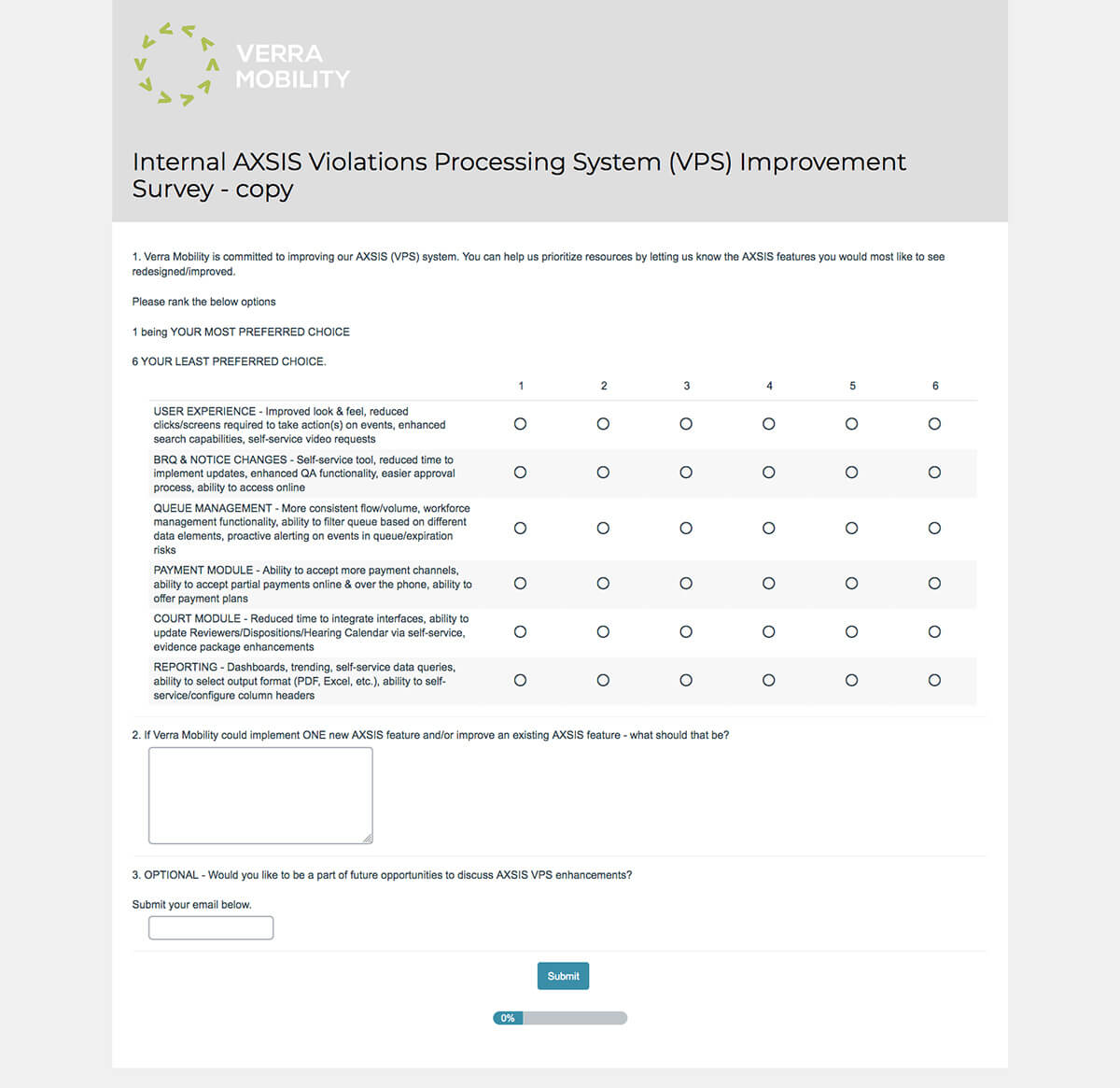
Focus group meetings involving a select group of employees who ultilize the legacy web app and business analysts, were held to assist in assessing user needs. I was part of the focus group. Surveys were also carried out with similar intent.
For the sake of prioritizing resources, product users were asked to rank features they would like to see redesigned/improved.
They were to rank their most preferred choice and their least preferred choice on a scale of 1-6
Having been well versed with the web app Axsis, I was exposed to some of the program’s limitations, frustrations and functionality shortcomings. My colleagues at Verra Mobility service delivery and transaction processing department, shared similar sentiments as validated during our focus group meetings and user survey.
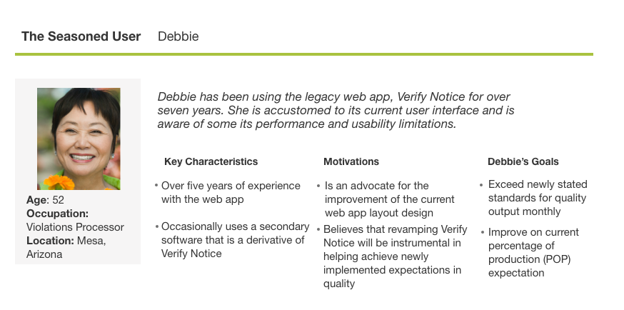
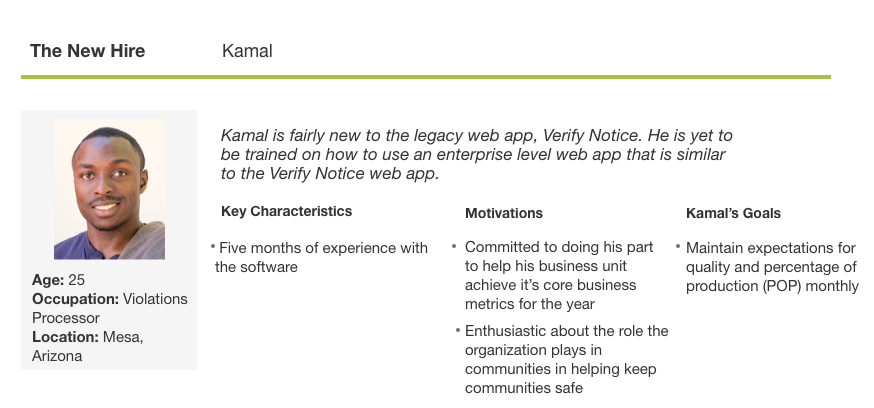
I created proto-personas describing the goals, characteristics and motivations of Verra Mobility Corp employees who used the SaaS web app, Axsis
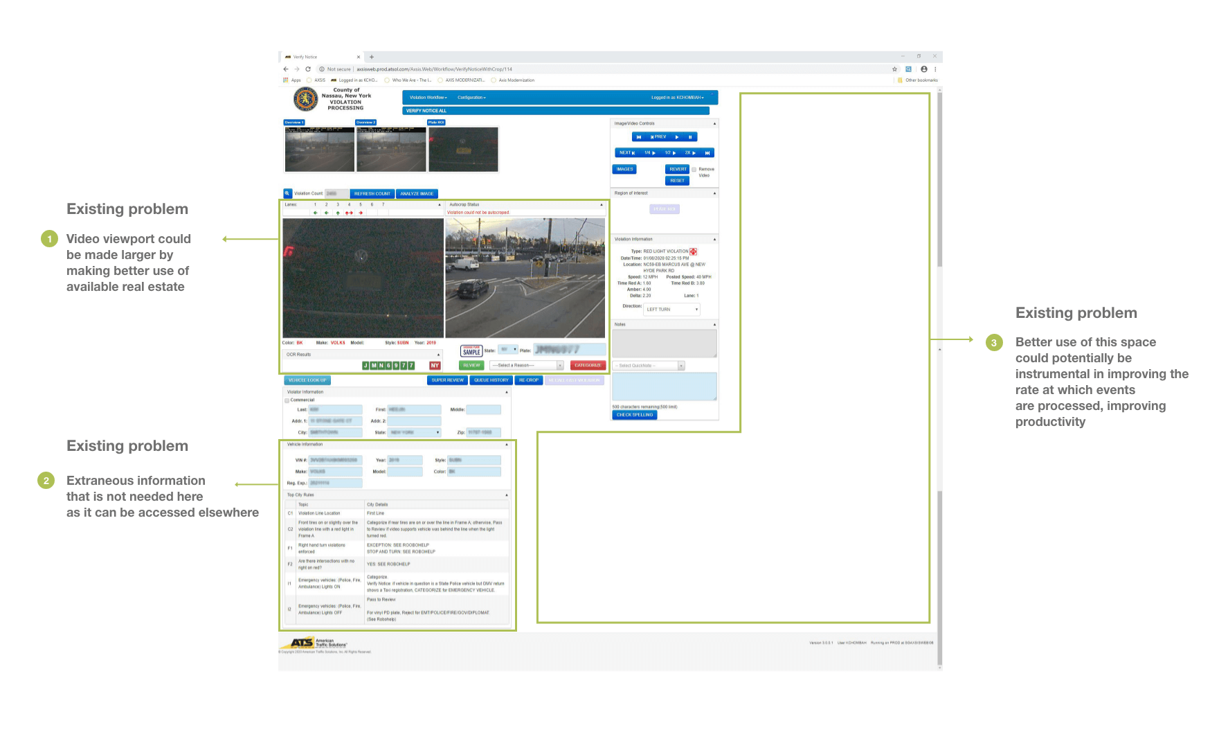
My intention for creating this illustration is to highlight some of the problems with the current layout designed over a decade ago
Heath McDonald, Verra Mobility’s user experience designer, was tasked with creating mockups that would address current user frustrations and program limitations.
The result was the creation of a modern user interface, which reflected the organization’s recent relaunch from American Traffic Solutions to Verra Mobility Corporation. The redesign includes new functionality and performance. Additionally, improved visual hierarchy makes for a more efficient workflow.
Iteration 1 (below) as designed by Heath McDonald
This iteration addressed a lot of the design issues identified and outlined during the research phase. The following aspect was still to be resolved:
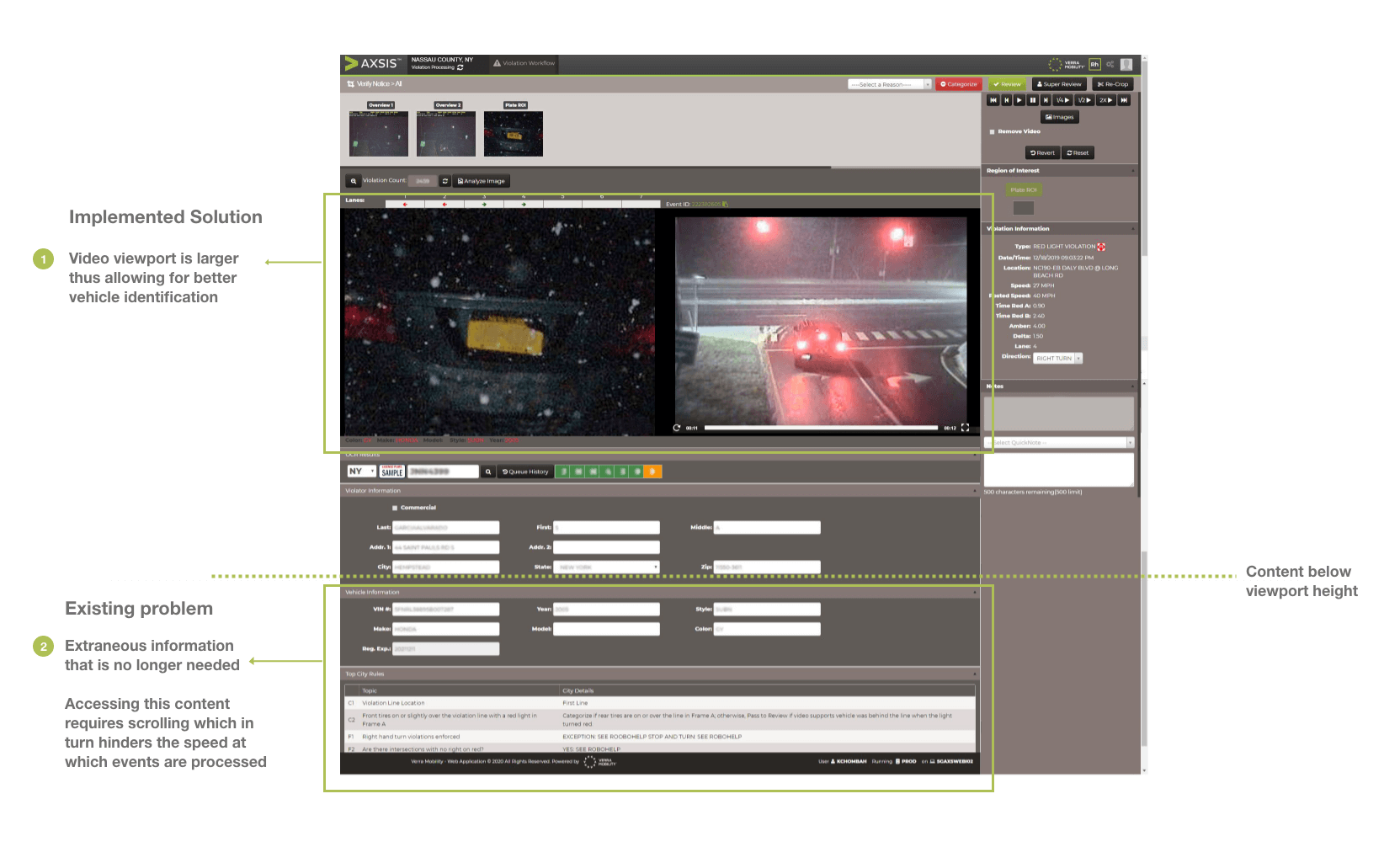
While the redesign is a significant improvement, (mockup iteration 1), it still poses the following challenges:
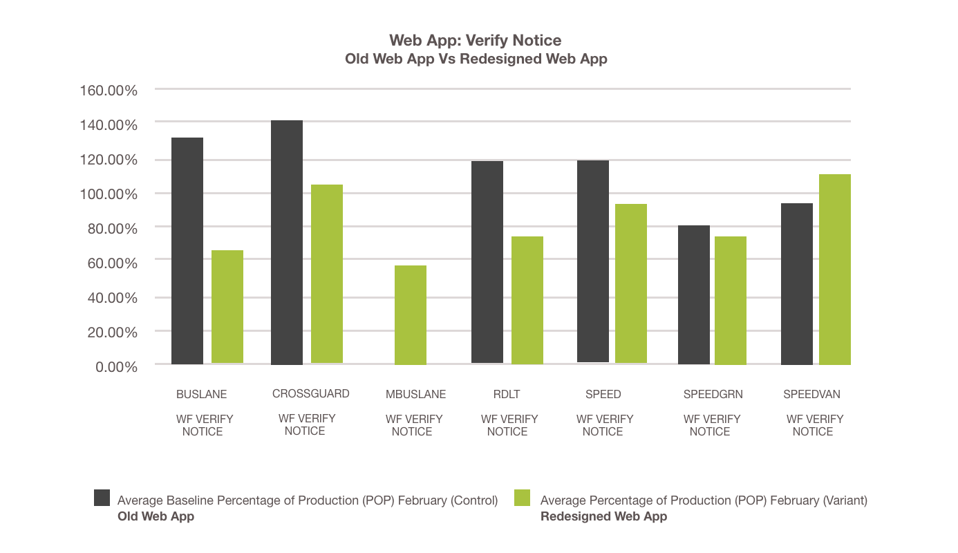
The decision was made to revert back to using the old web app, as no scrolling was required for that version, resulting in increased productivity.
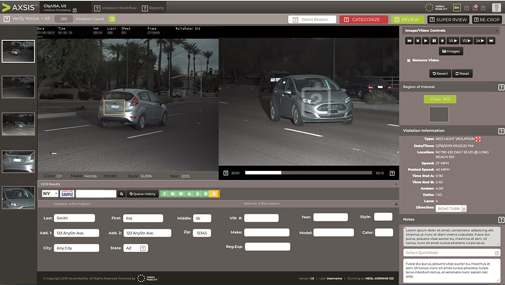
To remedy the need to scroll, I created (mockup iteration 2) and (mockup iteration 3) as seen here, as an alternative solution. Scrolling is not necessary for these two iterations. The web app, Axis Verify Notice is currently on pilot status and user feedback is continuously being solicited.
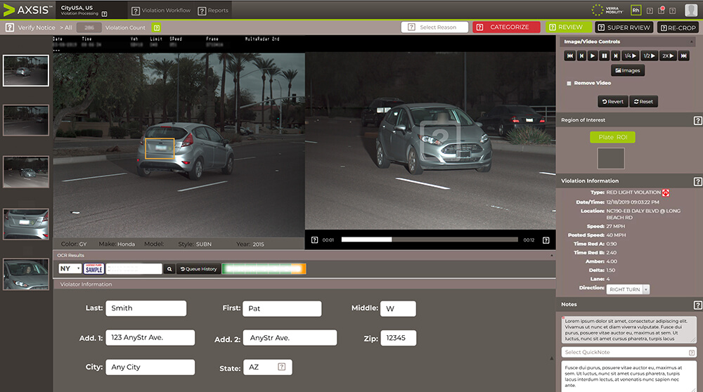
To remedy the need to scroll, I created (mockup iteration 2) and (mockup iteration 3) as seen above, as an alternative. Scrolling is not necessary for these two iterations. The web app, Axis Verify Notice is currently on pilot status and user feedback is continuously being solicited.